Design a Branded Logo that Works!
 Your business might be ready for a branding makeover or you may be getting ready to launch a new company and are at the early stages of development. The first place we usually start is with a logo, which will represent your business both online and offline. However, there is a step prior to creating your logo that most people skip and that part is called: Defining your target market. This process can become overwhelming, but the good news is when you get it right, it’s POWERFUL.
Define Your Target Market First
Why? If you determine that your primary market is comprised of men, then you certainly don’t want to choose pink as a color – so determine your target market gender. By the same token, baby boomers will generally resonate with natural colors and millennials will often be attracted to sharp edgy colors – so determine the age group you are targeting.
Do NOT pick colors because YOU like them. This isn’t about you – it is about attracting your target market.
Once you have your target market defined, make sure your branding has consistent messaging, i.e. keep the same website name, social media name(s), along with a consistent look and feel.
It’s LOGO time
The following are some things to consider when it comes time to create your logo:
Determine the main colors for your company image
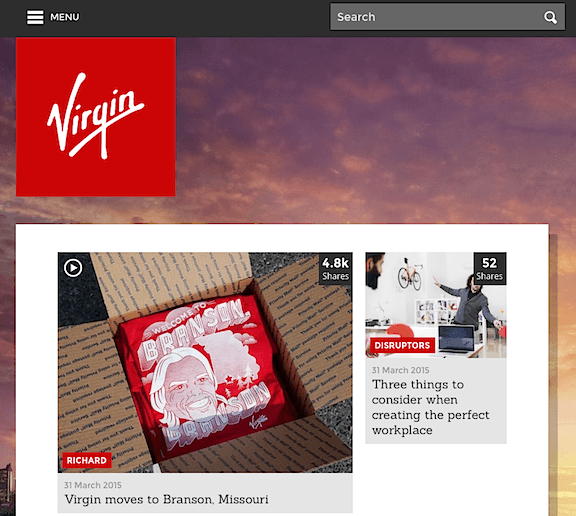
This could be from an existing template or starting from scratch. A good resource to help you find the right color scheme is found at Coolors, which is a simple way to determine what is the right fit for your niche. Your industry is highly relevant here, and so you will want to do some research on what other companies in your market are using. For example, health related brands typically use a lighter blue or green color. Businesses commonly have orange, red, or other bold colors, like this example from Virgin:

Choose the right font
This process could take some extra time, but determining the right style of text is just as important as color. If you need a large variety of free, quality fonts there are several resources available, including Dafont, Font Squirrel, and Font Space. If you need some creative ideas then Smashing Magazine has written an excellent article on finding the right typeface for your logo design.
Know your target market
After gathering color schemes and fonts the next step is to focus your attention on what your business is about. This will be based on your niche, the types of products and services that are offered, and a unique image that will reflect your mission statement. Some companies will utilize an animated or fun style of image, while others project a more professional style like these two examples from Hootsuite and Buffer:

Image and text or both?
While the previous example utilize images, some logos are very basic with the use of text, like the simple yet memorable MailChimp logo:

While there are no set rules for branding, it is a good idea to keep in mind readability, printing, and how your logo will tie into your website design. Even though your logo might be in color, taking a look at it in black and white could help you determine whether it will work or not.
Remember that your final version will be a part of the consistent branding on of all your online entities including your website and social media networks. Consistency and focus will help in creating an image that will be unique and memorable to your target market.
Here are some Before and After logo work with our Clients
Before:
After:
Before:
After:
New client development example:
Need help in this area?
Contact me!


0 Comments