Twitter’s New Mobile Look Released

The wave of mobile technology has led Twitter to redesign its popular social media platform in a recent announcement. Approximately one percent of users will see the new look, and accounts are being chosen at random.
My personal Twitter account, where I am most active, @susangilbert hasn’t changed yet; however, take a look at my company’s new Twitter profile @onlineprsuccess:

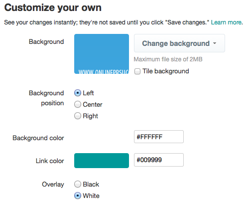
The latest design is intended to look like current mobile views, only on a desktop. With the black toolbar removed, Twitter has allowed for more space for text menus at the top with a larger font size. Users will also be able to access more color options for icons and the compose box, unlike the current limitation to just link colors on feeds. This is still located in the Design menu under settings:

While just a small number of Twitter users will see the new roll-out, Twitter will be releasing the updated look to more accounts soon. The change is clean, and easy to read, but will take some getting used to as we move away from a format that has been a mainstay for quite some time.
Has your profile been updated to the new mobile design yet?
Let me know your thoughts on the latest Twitter look!
Share this article with these Tweetables:
• New Twitter design is more like mobile – Click to Tweet
• Does your Twitter profile look different yet? – Click to Tweet
• @SusanGilbert shows us the new Twitter design – Click to Tweet


0 Comments