How to Make Your Website Visitors Stick
![]() I don’t have to tell you that visitors to our websites are busy people.
I don’t have to tell you that visitors to our websites are busy people.
Your visitors need to find what they’re looking for at a glance, or we risk them leaving fast . . .
And they’re probably not coming back.
That’s why adding icons to our websites can be so powerful. Website design is more than making content available. You must make that content jump out and grab your visitor’s attention.
Here’s 5 reasons you should be using graphic icons on your content—in your videos, ads, social media posts, sales pages, in your products and more . . .
5 Reasons to Use Icons in Your Website Design
1. Adding zest to feature lists
Listing the features of a product can be unexciting. Incorporating icons into your feature lists can make them instantly more engaging. Here’s a great example from Rapportive:
![]()
2. Getting attention for a new web application
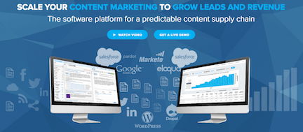
Grab your visitors visual attention and direct them to the new feature you want to show off. Once you’ve done this, you can let them know what makes your new feature so great. Videos and demos often work well for this — take a look at what Curata has done on their website:

3. List applications and products
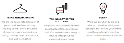
You can use an icon almost like a logo—one the instantly visually informs your visitor what your applications and products are all about like this clever design from Winston Retail:

4. Create an interactive page
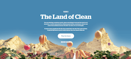
Why settle for dry introductions when you can add a fun user experience that is both fun and informative? Games are especially popular, and Panera Bread knows exactly how to appeal to their customers with “The Land of Clean:”

5. Increase readability on mobile
Icons and creative design elements give your reader visual relief from long blocks of text and help them find the most important sections of your website. A mobile responsive website that also works well on a desktop can make finding products quick and enjoyable like this example from The Production Kitchen:

It’s important to keep your target market in mind. Don’t assume that they will know what your website is about — keep your navigation and message clear through your graphics.
Through target market research find out who your visitors are, why they are searching for your products/services, what their needs and desires are and how you can best deliver this to them.
So where do you go for icons?
The most unique icons can be developed by your graphic designer, though they will tend to be more expensive than finding a ready made icon for purchase. Other resources you might find useful are freelance websites like Fiverr, Behance, and Freelancer.
Our own website services can help you achieve the results you are looking for in your niche. Take a look at our designs right here.
Many of the stock photo sites also have icons:
A website that attract visitors and encourages them to stay and want to know more includes creative design elements that clearly reflect what your brand is about. Icons are a fast method to use to help them navigate quickly and get the to page they are looking for without a lot of text or hoops to jump through.


0 Comments