What Your Website “About Page” Should Say About You
 What does your About Page say about your brand or business?
Are website visitors leaving without enough information?
One of the most critical components of a website is the About Section, which should answer important questions about what you have to offer your market in a compelling way that appeals to their needs. Instead, many miss the mark on and create something that is bland or too basic.
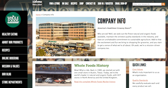
Not sure where to start? Here’s a great example from Whole Foods with a simple, yet informative description with images on the company and its history:

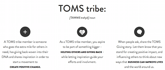
Each company has its own brand identity, and this content should be both clear and interesting to their readers. This may include anything from a great story about how you began to what you provide your market. TOMS Shoes is another good example of a clear message on helping those less fortunate while offer high quality products. Instead of “About Us” they refer to themselves as “TOMS Tribe:”

Your brand or business has its own story to project, which is unique to your message. The use of professional photos, graphics or videos will garner the most attentions along with content that reflects your culture. Depending on your niche that can be witty or informative. They key is to make it stand out with a clear understanding of who you are.
Let’s break this down further.
A Clear Description Focused on Your Audience
It’s great to include a detailed description about what your brand or business has to offer, but if you focus this too much on you then you may lose interest. People want to know right away what can be provided for them to meet their needs. Instead flowering your presentation with too many accolades choose instead elements such as real testimonials, ways your company can solve specific problems, answers to tough questions, ect.
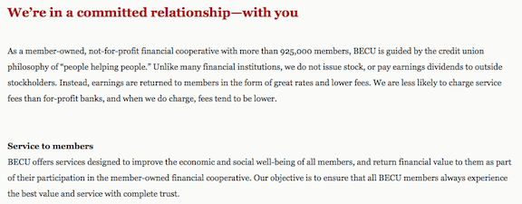
Here’s a credit union based in Washington State, BECU, which really gets this concept by focusing on its members first in their About Page:

Not only do we know who this bank is, but why they offer what they do with an approach that sets them apart from other financial institutions. Their mission is clearly to serve their members by fostering a relationship with them instead of making the description about the company itself.
If you’re not sure whether your About Page is more customer-centered there is a free and handy tool available, which can automatically check this for you. Results will show the percentage of what’s focused on you rather than your customers. After running a quick test on a popular retail website the software quickly produced these results:

By tweaking a few words your business can change the score to more favorable one. For example, adding more “you” or “them” and less “we” or “us” can shift the focus to your target market. This also provides a more personal approach that projects to your readers that you understand their needs.
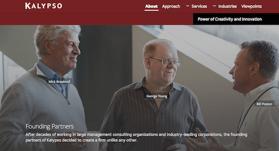
This is not to say that you should not include the important aspects of your brand or business such as the employees, history, testimonials, ect. After addressing your customers’ needs your information humanizes your company and provides an inside look into what makes you unique like this business consultant firm:

In order to stand out from the rest of your competitor’s your business will need an authentic message that establishes trust. Strive to make your About Page less formal and more approachable by focusing on your customers and providing real images and videos from your business. The old model of the corporate About Page is no longer effective in attracting leads to your website.
Update your content and keep it fresh throughout the year, especially as your brand or business engages in new services or products, advertising campaigns, promotions, social causes, ect. Be sure to include a simple CTA which provides something of value with clear links to your social networks.


0 Comments