How to Have a More Successful Website Design With Multivariate Testing
 If you have a high traffic website it’s important to know which design elements are working well in order to increase your conversions.
One way to find out is through testing, including A/B testing and multivariate testing.
So what’s the difference between each?
A/B testing compares two versions of your website design while multivariate testing lets you select different elements to test.
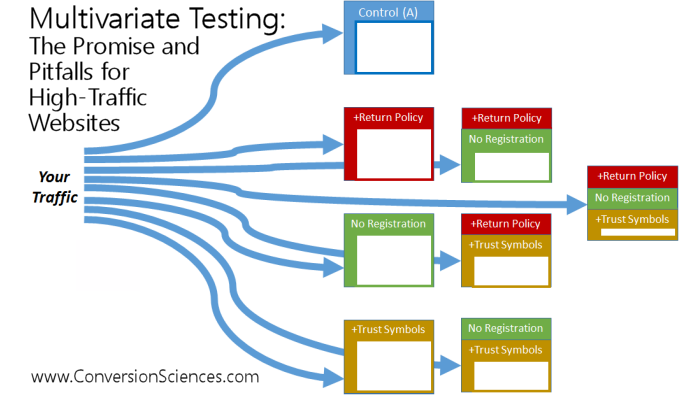
If you would like to hone in on your image header, website icons, or landing page then multivariate testing can help you. It’s a process of creating different versions of the design elements, and then taking a look at different variations of each. These are what make your website unique, and can help you better understand a split test of the volume of your traffic and how this affects sales coming from those. Here’s an illustration put together by Conversions Sciences, which explains exactly how this works:

To better explain this process is one example of testing two versions of a headline, text and header image, which would result in 3 variables. Each variable has two of its own versions, which can be further tested in different combinations for the best results. Traffic is split between each of the different versions of your page. Theoretically you could come up with tens to hundreds of versions, whereas A/B testing allows for three or four versions of your website.
If you plan on completely changing your landing page, then A/B testing can help you achieve better results where multivariate helps you to focus on refining and improving an existing design. It allows you to see exactly which area of your page has the most impact on your conversion goals, and provides a metric that tells you which sections influence your conversion rate and the ones that aren’t.
Getting the Best Results
It’s important to keep your section measurement to a minimum as each one that is added doubles the number of combinations you’ll need to test. For example, focus on the headline and image instead of the headline, image, and text.
Not all sections will have the same impact on your conversion rates such as the footer, which can removed as a variable in order to get a more powerful, section specific report.
There are a few visual website optimizer tools and plugins available with the ability to create a multivariate test visually. Many of these include a WYSIWYG editor, which allows you to selection the different sections of your website and run a test without having to tag each one.
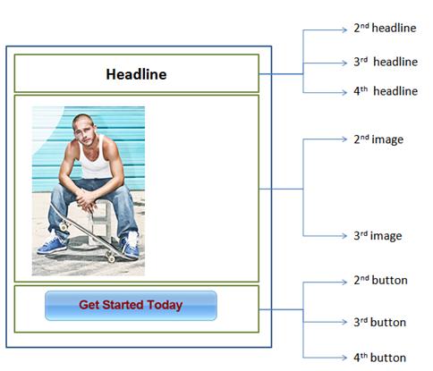
According to Invespcro a typical test would look like this example:

Their version of this type of test focuses on the website’s headline, main image, and the CTA or Call to Action. As you can see in the above image, each element is broken up into three different variables for testing, which produced 48 options. As more page elements are added so can the variables, and so using specific software can help you to refine your choices automatically in an easy to view results dashboard.
Alternatively you can enlist the help of a website developer who can perform this type of test for you. The end results will help you to find:
- Errors and problem areas on your pages
- The impact of elements on your conversion rates
- How to fix website issues the are occurring
- Solutions on increasing your visitor flow and navigation
The slower holiday season is a good time to invest in this type of test in order to maximize your website’s effectiveness in the coming year. Make sure you are paying close attention to the results, recommendations, and how many elements you are measuring at a time in order to have the most complete and accurate data.
As you combine both of your A/B testing and multivariate testing together you will be able to get the best results from your website design, especially if it is an eCommerce or membership platform.


0 Comments
Trackbacks/Pingbacks