
 Increase Your Website Conversion Rates With Less Friction

Do visitors turn away too quickly from your landing page as evidenced by high bounce rates in your analytics?
Or, perhaps you just aren’t seeing enough sales from all your online efforts.
The problem may be in the design and execution of your website, leaving your readers distracted and/or frustrated when they come to your domain. “The confused mind says NO”, is a well-known marketing term that fits this situation to a T. “Friction” is a conversion reducer, but with a few adjustments your business can remove the roadblocks and attract more sales.
If you want to sell more books or products, or want prospects to pick up the phone and call you, your website can’t just have the applicable information – it needs to convey it quickly and easily. You need to tell people what you want them do do!
QuickSprout released a study on the state of lower conversion rates for websites, and define friction as “any variable, website quality, or user behavior trend that is slowing down (or entirely halting) the progression of your company’s sales cycle.”
As a business you can’t afford to lose visitors who decide to not take action due to a bad design, poor content quality, confusing search functions, and so on. If the process is too overwhelming for your readers then they will move on to a website that can offer them what they need right away.
Here are several strategies you can use to retain your website visitors and encourage them to make a purchase:
Keep It Simple
A slow loading website is just one factor in the amount of time a person decides on in whether they will leave or want to learn more information. Other culprits can include too much content on the front page, complicated or obscure optin forms, or a lengthy checkout process. Have someone evaluate your website and apply the “5-second rule,” where your visitor should be able to quickly figure out what your business is about, and how to find information.
By condensing the information and visual content on your website you can increase your conversions by as much as 15 – 20%. Begin this process by focusing on the immediate need of your target market. What is the one thing your customers desire the most? Save in-depth explanations for sub-pages, and provide the most important content up front.
Remove Distractions
If your visitors are distracted by too much content or are not taking notice right away, especially on mobile, then psychologically they will seek a more appealing design. This can include poor quality images or not enough visual content, colors that don’t match your brand or website design, lack of response from desktop to mobile view, too many links, ect.
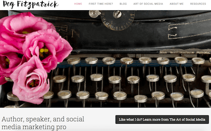
A more simplified approach with one optin and clear navigation that only includes necessary menu items can help improve your conversions and attract subscribers, like this example from author and marketing expert, Peg Fitzpatrick:
Clear Communication
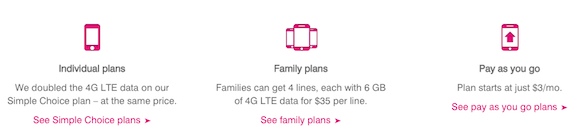
Reduce the number of options or offerings your business may have with a clear focus of what your leads can expect to receive. Reduce their research time by showing clear examples, testimonials, and easy-to-follow selections. T-Mobile has a very user-friendly design where visitors can quickly decide what to purchase:
As a business you want your leads to be able to easily make that first purchase because once that happens your brand now becomes familiar to them and they most likely will return and recommend your website to others.
Be Transparent
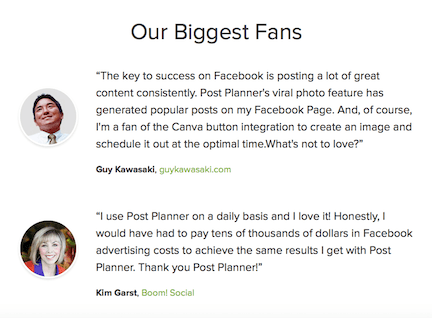
People want to know right away whether your business is a trusted brand. Include any testimonials, social media feeds, videos, and links to current clients where they can learn more about your company through real recommendations. This information should be easy to find, and can include photos and links for more impact like this example from Post Planner:
By implementing this on your website your business can increase your conversion rates by as much as 30 percent according to QuickSprout, and improve your social proof and influence.
Soften Your Call to Action
Instead of using your content to directly sell to your visitors your business will attract more customers by changing the way you phrase you call to action(s). Here is what this could look like:
Instead of: Use:
Buy Now Check This Out
Support Discover
Sign Up Earn
The idea is to appeal to the needs and desires of your target market and focus on their greatest pain points. When you provide something useful or of high value to your audience they will be more willing to make a purchase and recommendation.
By understanding exactly what causes conversion friction your business can begin the process of eliminating problem areas on your website with a more customer-centered approach. Take the time to evaluate the current activity from your landing page and ask yourself whether your brand message is simple, clear, meets the needs of your audience, and offers navigation that prompts them to make a purchase or contact you for more information.
The key is to reduce the amount of information as much as possible with an attractive design, and offer a great experience to both mobile and desktops users.

0 Comments
Trackbacks/Pingbacks